Every year it seems most designers go through a website redesign. At Least I do. This time around – rather than just shooting for a pretty design, I focused a lot on the content and usability. For planning the redesign, I thought about why I wanted to redesign, what I wanted in a redesign, and how to execute it successfully.
Below I break-down the process that I took to achieve what I think has been a huge step forward. I hope you can pick a few things to learn from in this post!
Planning the Redesign
Why I want to redesign
Like the Internet, my style in design changes quite often. With my old site, I felt that the overall layout was a bit cluttered. I wasn’t entirely satisfied with the usability, but most importantly, the content was a mess.
The site was built on a Wordpress theme that I had received through a bundle deal, so I didn’t have the license for any support or updates. Overtime it got clunky, and minor bugs were starting to surface.
Unfortunately that theme also limited room for growth – i.e. fine-tuning, feature additions, etc.
What I want to improve on
After looking at my old site’s faults, I now had a vision on what I want in a new website. I want a clean (responsive) layout with the ability to always stay updated, with easy readability, and meaningful content. I want to do it right – and build on a framework that leaves room for fine-tuning and improvement.
How I want the site to be used
I want my site to be a pleasure to read for others, and easy to navigate for clients.The site is for me too—It’s kinda like my online home. I want to be able to look at it and know that it works. I want there to be room for me to grow, and I want the ability to add whatever I want – whether it be a landing page for a product, or just a page for some fun content.
Keeping focus on what I want, and how I want it to work is key at this point. I consider what pages must be left out, how pages should link from one another, and only write content that is necessary.
Updating My Image
Knowing that my website needs a complete redesign, this is the perfect time to refine my whole personal brand!
I freelance under my name, not as a company (since it is only just myself), and I don’t necessarily want a specific logo—But I do need something to help make my personal brand and online presence stand out.
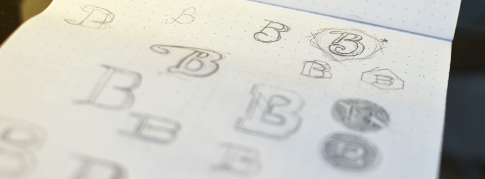
Designing a simple monogram is exactly what I feel would fit my look. I sketched a few concepts, then started vectorizing a few of my favorites.

While working on concepts for my monogram, I also worked out a color scheme. I believe that consistency is extremely important, so the colors throughout my online presence need to match.
After applying my color scheme to the monogram concepts, I gave it some time and got some solid feedback from my peers for a final decision on my new look.

Now that I have a monogram and a color scheme, I can start planning and applying it throughout my online presence (social accounts, website mockup, resume, etc.)
Focusing the Content & Development
Content comes first
Before I even started mocking-up a design, I drew out a sitemap, and wrote majority of the content.
I reviewed the sitemap and content over the span of a few days, just to make sure I only display what’s necessary.
Once I felt confident in the content alone, I move onto the actual development of the website.

Finding the framework
I’m not a very good developer so I built my website on a framework called Genesis powered by Wordpress.
I can’t remember how I stumbled upon Genesis, but I read through the features and was instantly sold!
Building the site
I purchased the Balance theme by StudioPress, which also came with the regular Genesis framework.
I worked locally on building a child theme off of Balance.
At this point I had a working site with my color scheme and new look applied.
Once December (2012) came around, I took my old site offline with the help of a construction plugin, and started making the switch to the new site!

Over the month of December while my site was offline, I used that time to implement the new site: Add all of the necessary content, and make sure that it functioned properly.
A not so crazy launch party
January 2nd came and I deactivated the construction plugin, which made my site live for everyone to see!
I posted the first article on my new website, sent out the tweets, and shared the links on Facebook.
Unfortunately it was a small launch. I didn’t do much to promote it other than send out the news and occasional updates on my social accounts.
Also – always remember to add your Google Analytics before your site goes live! I happened to add it on launch day after I had already “flipped the switch”...
Conclusion
Although I don’t have a huge following, and the launch wasn’t massive, I’m happy with how my new site turned-out. I think it's a huge step forward.
Since my site is still very much new, I’m still making minor tweaks here and there – so if you come across any broken links, bugs, or typos, please don't hesitate to contact me.
I'd love to hear your feedback on my new redesign in the comments below! If there's anything you might have questions about, I'd be happy to answer! :)


