
Last week I announced my latest project: Your Freelance Career.
Your Freelance Career is my new blog where I’ll bring transparency to running your own freelance business. I want to share, collaborate, and help other freelancers learn the ins and outs of freelancing.
(If you’re curious why I decided to create a new home for my freelance content, you can read more about that here.)
Today, I’d like to share the process I took with creating the hand lettered logo for Your Freelance Career.
The concept & sketching
For You Freelance Career, I want the style and mood to convey a balance between happy, classy and honest – so I instantly knew the direction I desired was a clean script logo.
With that in mind I went straight to paper and started hand lettering some ideas.
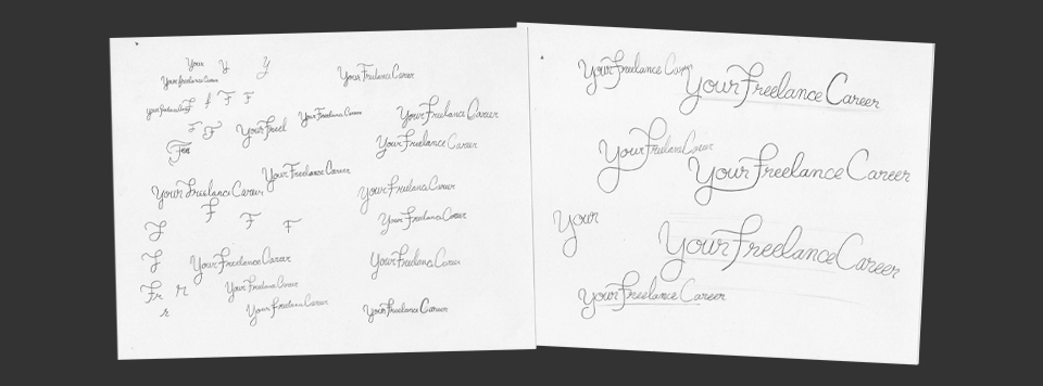
Once I had the logo I desired on paper, I redrew it and inked it to get it ready for vectorizing.
From sketch to vector
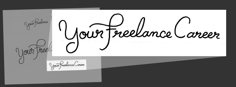
The logo itself has to be vector, so before I can do that I had to get the logo onto my computer and prepped for Adobe Illustrator.
With the inked logo, I scanned it in, and opened it in Adobe Photoshop.
Inside Photoshop I cropped the page down to isolate the desired sketch, then adjusted the levels to clean it up.
Once the contrast is high, I erase any unwanted details and save it as a .jpg.
It's time to turn these pixels into a vector logo!
In Illustrator I place the adjusted .jpg of the logo on a locked layer, then start tracing it with the pen tool. I don’t outline the shape, I simply create a single path, then apply a rounded stroke.
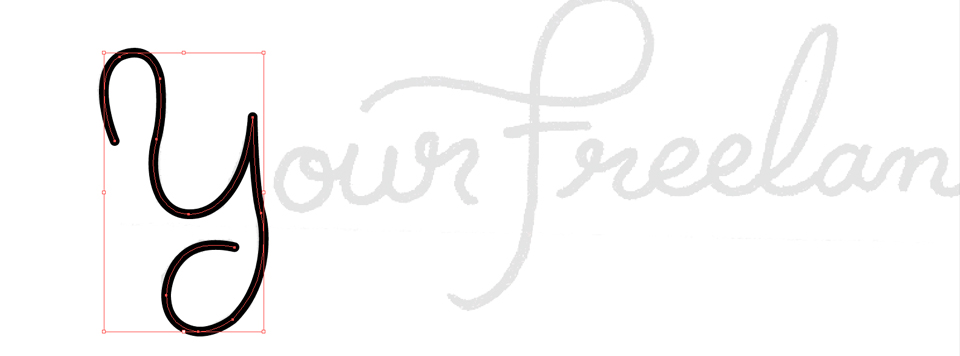
Taking one letter at a time I trace, adjust, realign, kern, and review. Some of the letters can be reused by copying, pasting, then moved until the lines connect.
I take breaks often to keep my eyes refreshed on the design, so when I sit back down I can spot out what needs adjusting. This especially works when I revisit it the next day.
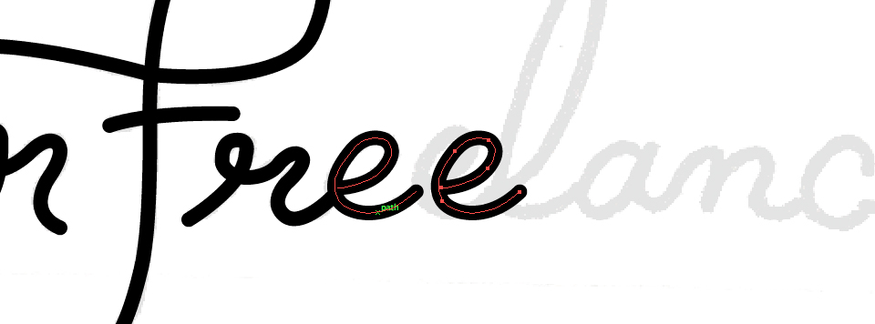
With the logo being made up of multiple paths (with a stroke), I need to combine it all into a solid object. To do this I copy and paste the logo onto it a new layer, so I can always go back and make edits to the original paths if needed. With the paths still selected, go to Object > Expand – doing this will turn the paths with strokes into objects (or shapes) that can now be combined. I then use the Pathfinder to “Unite” the shapes – turning the logo into one solid object and ready to be used.
The final result
The final vector logo is saved and can now be brought into Photoshop as a shape layer to be used anyway desired.
Overall I am very happy with the feel of this hand lettered logo. It has the clean and honest feel I was going for.
Sharing is the easiest way you can show your appreciation for the posts you enjoy. If you enjoyed this post, please take one second to share on your favorite social network:


