
Today I want to share with you behind the scenes of how I hand letter and illustrate a concept on paper, then use the power of Illustrator to vectorize and bring the design to life.
Beginning on paper, I draw out the concept of the design. For this particular example, I'm going to use the word, "Electric", because it has a very specific style that I have in mind, and I'll be able to use it to show some of the different techniques I like to use when designing an illustrative lettering piece.
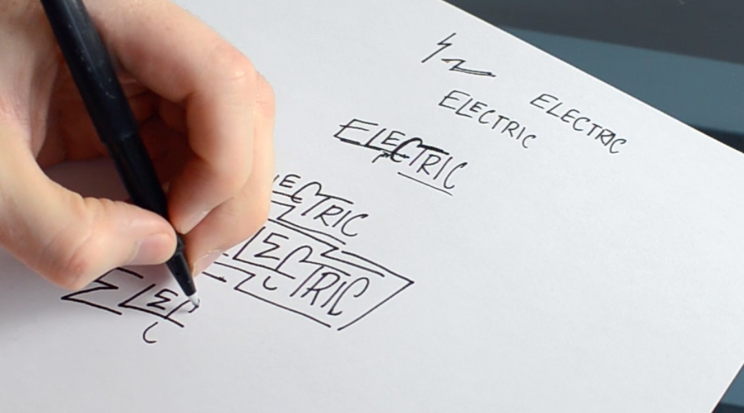
I start by writing out the word. Typically, I dive right into it using a flair tip marker or sharpie—Unless it's a script piece, in which I'll use a pencil to be more precise with my line work.
Writing out the word first is so I can visually see how the different letters could potentially flow together. Also, it helps to have it written down for a reference, because many times have I been hand lettering a piece and completely forget a letter.
I'll continue to iterate and write out the word or phrase to see how the letters interact. As I progress, I'll start to tuck letters into certain spots, bridge one letter to the next, and/or add illustrative elements.
With using the word, "Electric" for example, I want to incorporate lightning bolts or zig-zag elements.
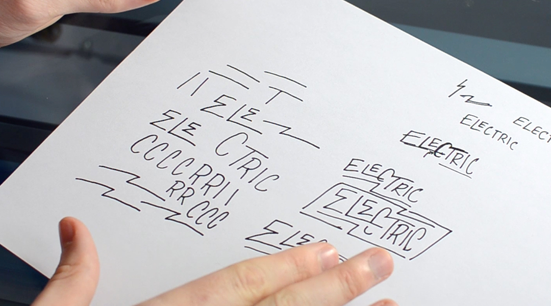
Once I discover the right direction for the design, I'll hand letter and illustrate the different elements, making sure that none touch, because I'll be manipulating them together once I'm in Illustrator.
I'll give myself some variety – I'll draw multiple letters, illustrative elements, and other various shapes/lines that I can pick and choose from when putting it all together.
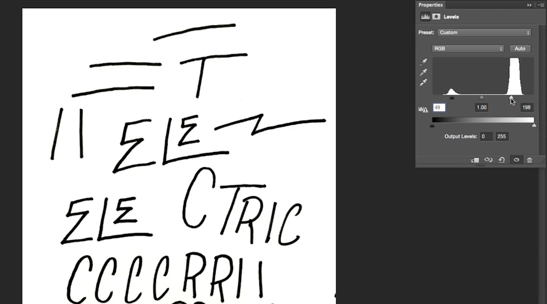
Hopping onto the computer, I'll take a picture with my phone and send it or scan in the sketched design. I'll then open the sketch in Photoshop to prep the line work for Illustrator.
Dropping the sketch in a new Photoshop document, the first thing I'll do is Crop (C) the image down to only show what's needed.
Next, I'll apply a "Black & White" (Option/Alt+Shift+CMD+B) and "Levels" (CMD+L) adjustment layer onto the photo.
The goal here is to boost the black and white using the Levels to remove any shades of grey or imperfections on the paper. You can also use the Brush Tool (B) to paint white over any remaining specks you don't want to vectorize in Illustrator.
After the prep work in Photoshop, I'll save the edited design, move over into Illustrator, then drop it in to be traced.
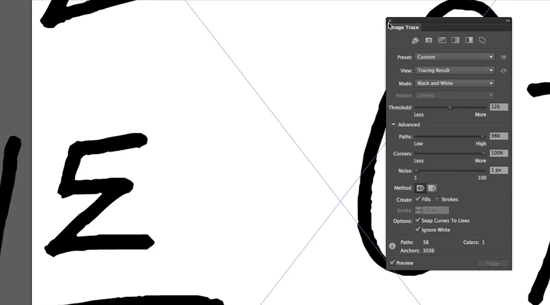
After creating a new document in Illustrator and dropping in the edited image, simply click "Image Trace" in the top menu.
The image is now vector! However, it lost all of it's fine texture. So by clicking into the "Image Trace Panel" next to the "Image Trace" button, I can play with the advanced settings to bring back the rough look I want that was given by the marker. It's also important here to click "Ignore White" to isolate the lines as separate objects.
Once I have the right look, it's very important to click "Expand" up in the top menu, or go into, "Object > Expand..."
What was a raster image, is now a group of vector elements which can be manipulated and combined to design the concept I'm going for.
Creating a black Rectangle the size of the Artboard, locking it onto its own layer, changing the new vector graphics to white, and moving them off to the side, I'm now set to start designing!
Ungroup (Shift+CMD+G) the objects, and now I'll pick and choose the letters I'd like to use.
When I select the letters I'd like to use, rather than just grabbing them, I'll click (or Shift+Click to select multiple objects), then Option/Alt+Click to duplicate and drag what's needed.
I'll continue to rearrange the letters and elements I'd like to use. Then I'll meticulously nudge and manipulate the letters to form a cohesive layout.
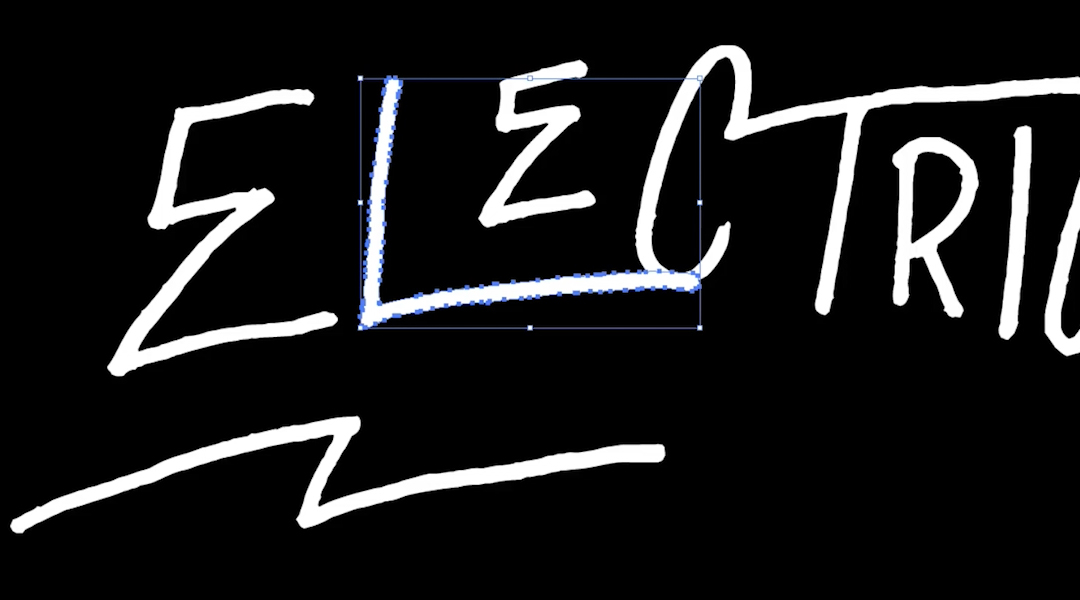
When I'm resizing and altering the vector objects, my two main tools I use is the Direct Section Tool (A) and the Free Transform Tool (E).
The Direct Selection Tool (A) is used to select individual and multiple points of the vector objects. This is great for meticulous tweaks to the shape of the objects. I can shorten parts of a letter, change angles, and so much more.
The Free Transform Tool (E) is a smarter way to stretch, skew, distort, and alter the perspective of an object.
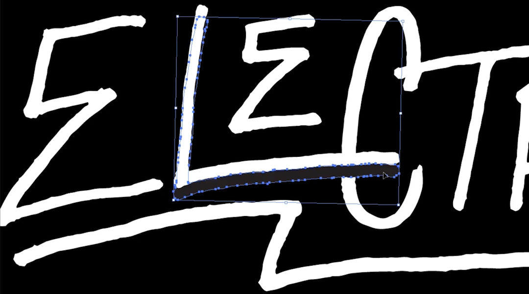
To get overlap effect of the "L" going across the "C", I simply Copy the "L" (CMD+C) and Paste in Back (CMD+B). Change the color to black, nudge it down a bit, then select the "C" and Send to Back (Shift+CMD+[).
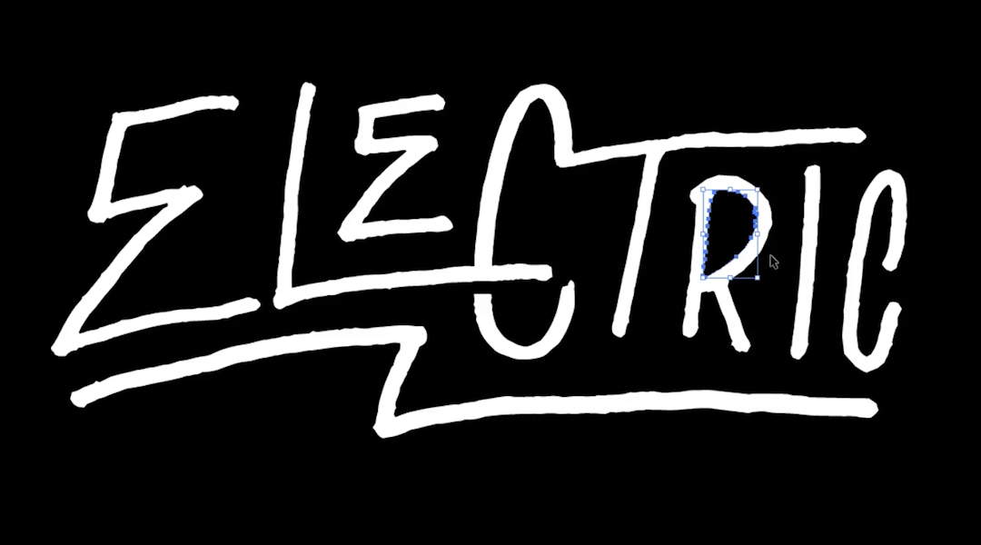
Once I have the concept fleshed out and all put together, I'll go into the Pathfinder and Merge all shapes together.
Once the design is all one object, Ungroup (Shift+CMD+G), select the white objects, then go under "Select > Same > Fill Color". This will select all objects of that color, then Group them (CMD+G).
Select All (CMD+A), Shift+Click the white, and Delete everything else selected. This gets rid of any other unneeded color or shapes that were created along the way of the design process.
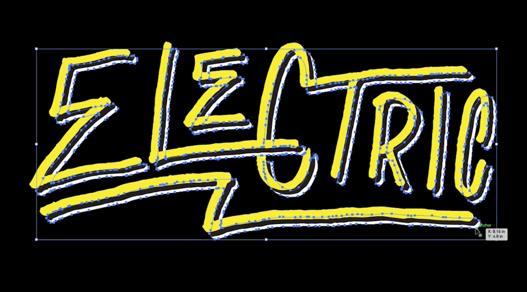
It's finally time to give this some color!
Select the design, change it's color, and to give it a bit more depth, I'm going to Copy (CMD+C), Paste in Back (CMD+B), change the color, then nudge it down and to the right.
I'll repeat that last step one more time and I'm left with the final vector design!

Hopefully you were able to pick up some techniques and new tricks from this tutorial. It can be a lot to digest, but with practice, you'll get the hang of how to use the software to its full potential, and what tools to use when and when.


